Understanding the challenge
Victor Valley Family Resource Center is a non-profit 501(c)(3) headquartered in Hesperia, California, serving unhoused individuals and families across San Bernardino County. Founded in 2009, VVFRC uses a Housing First model to provide transitional housing, mental health services, job training, and case management. Despite the depth of their impact, including a 6% recidivism rate compared to California's 61% state average, their existing website and brand did not reflect the hope and energy of the work they were doing. The design was grey and somber, which undercut their ability to attract donors, volunteers, and community partners.
Brand refresh approach
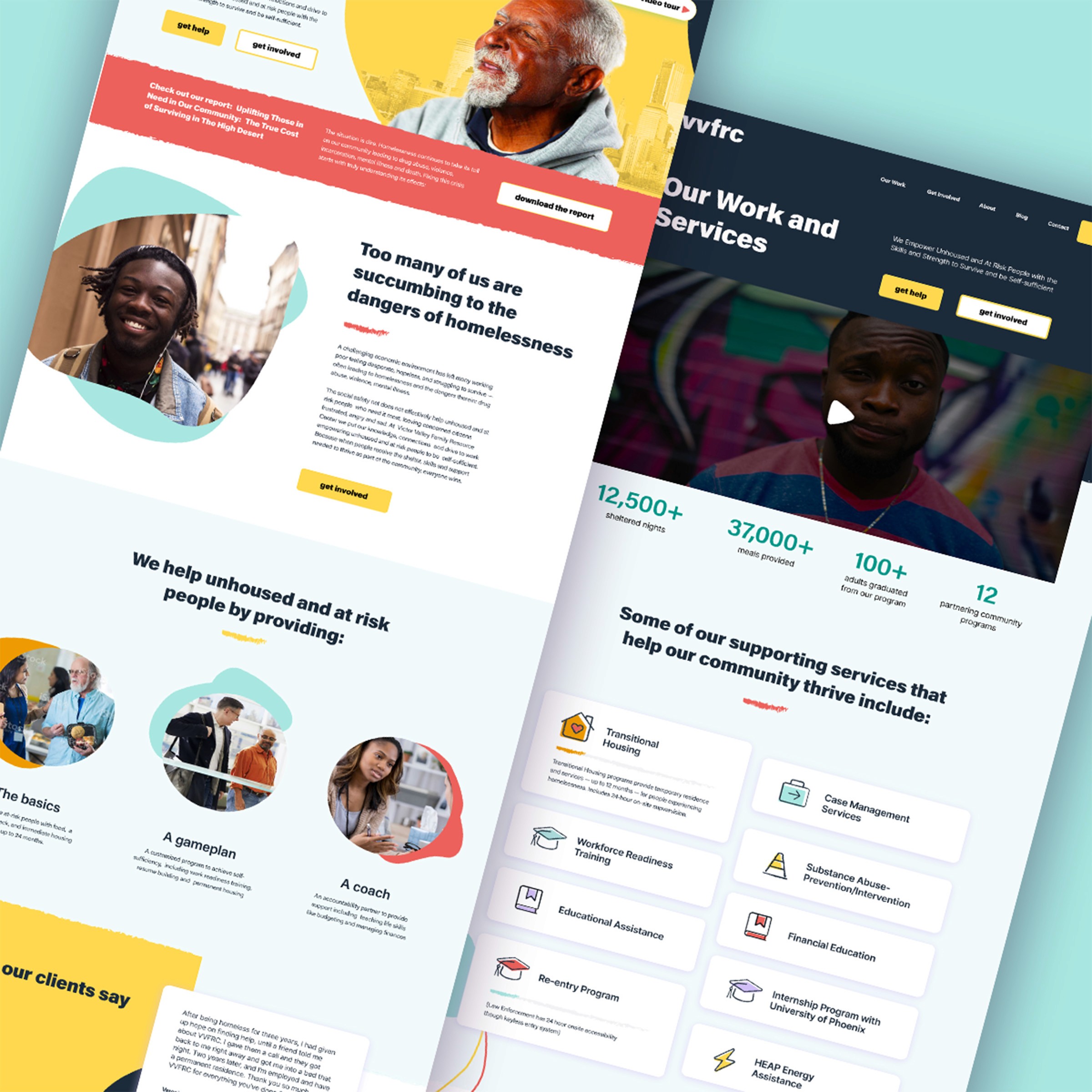
The brand needed a complete tonal shift. I developed a colorful, warm visual system that communicated optimism and community without losing the seriousness of the organization's mission. The new palette moved away from institutional greys toward vibrant, accessible colors that signal hope rather than hardship. Typography was updated to feel approachable and human, and photography direction was established to show the people VVFRC serves with dignity rather than as subjects of charity.
Website redesign
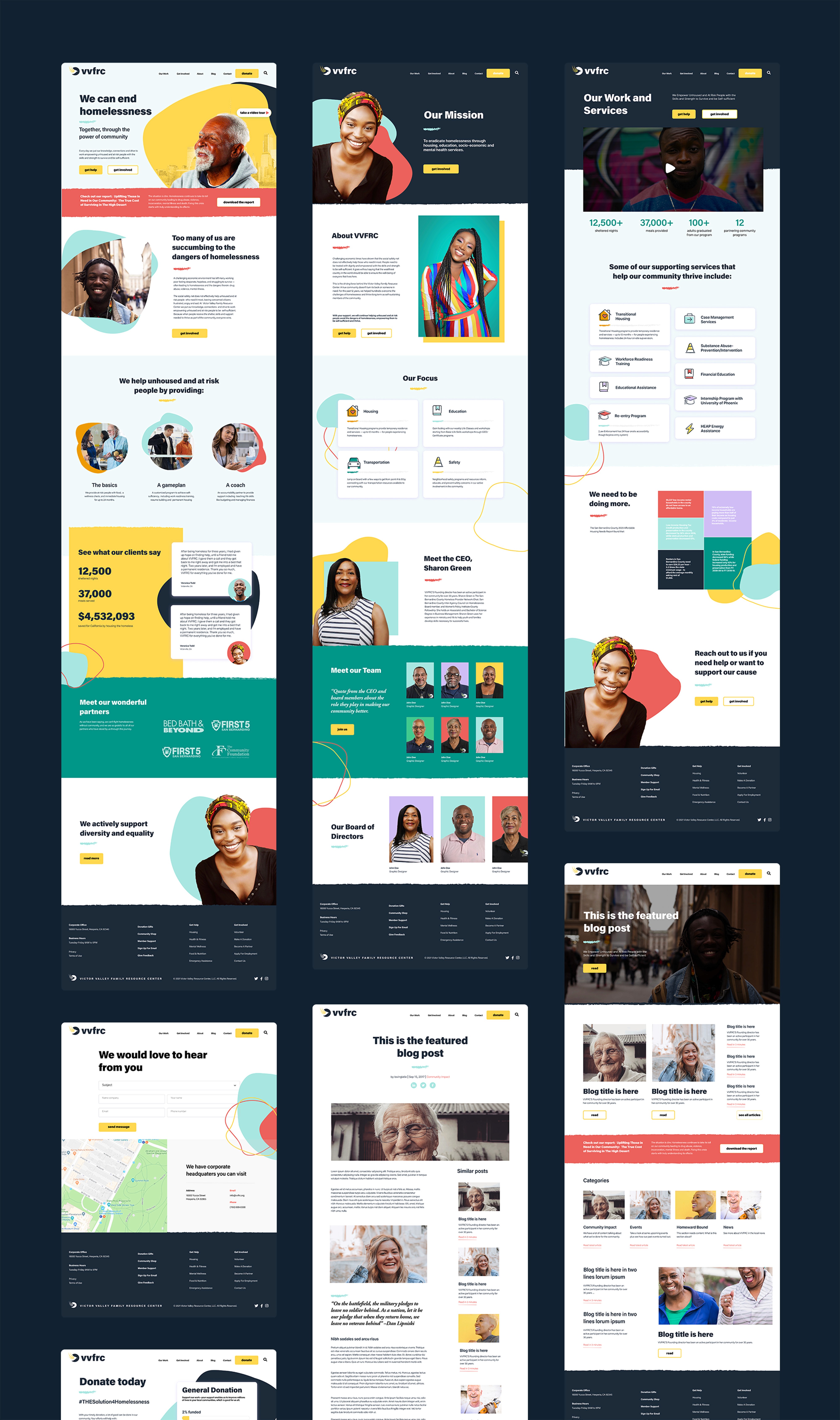
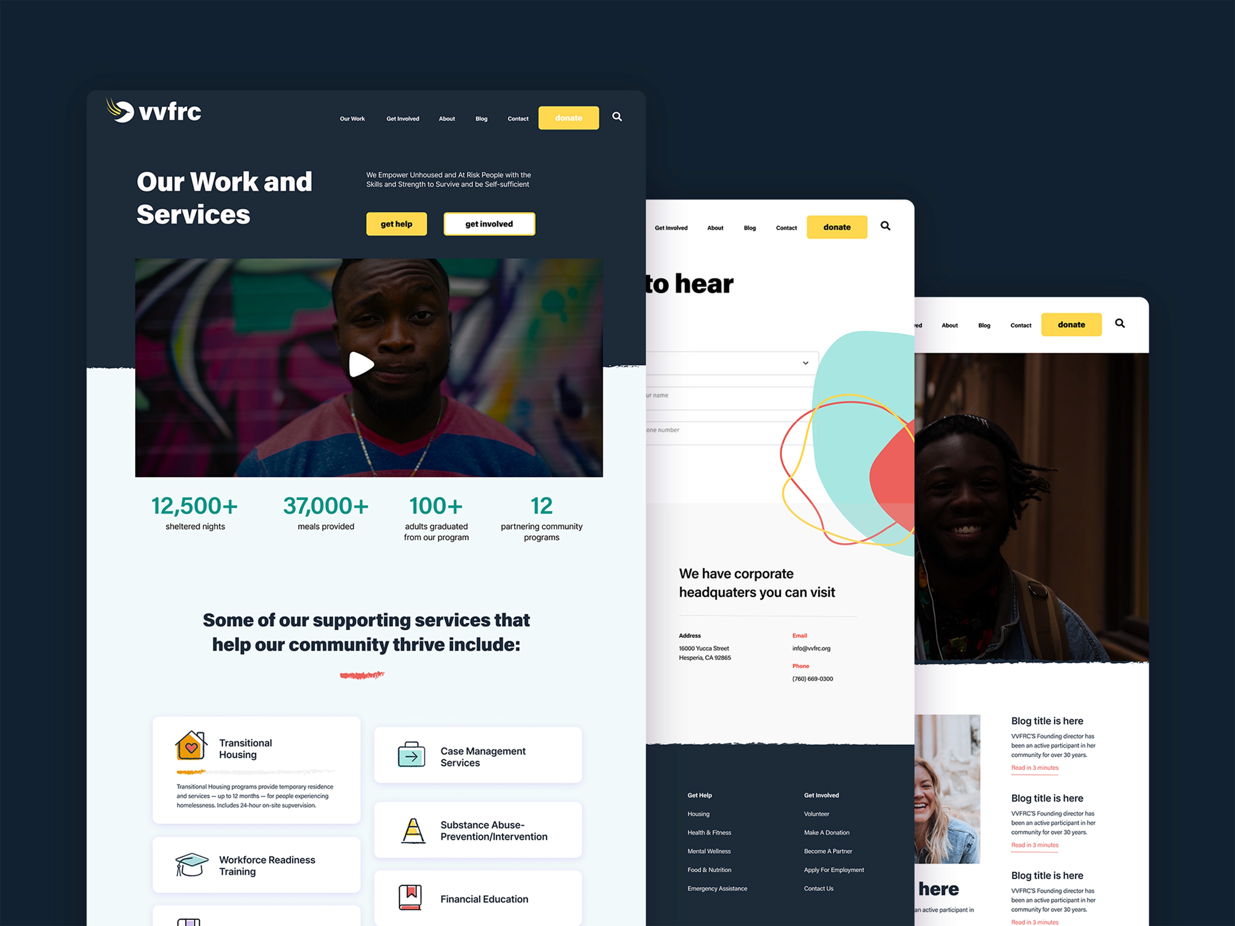
Using Figma, the website was rebuilt around the needs of three distinct audiences: people seeking help, community donors and volunteers, and partner organizations and government agencies. Navigation was simplified to give each audience a clear path. The homepage was redesigned to lead with the organization's mission statement and outcomes rather than a generic welcome message. Service pages were structured to make it easy for someone in crisis to find what they need quickly. Donation and volunteer CTAs were elevated and repositioned throughout the page flow.
Brand guidelines
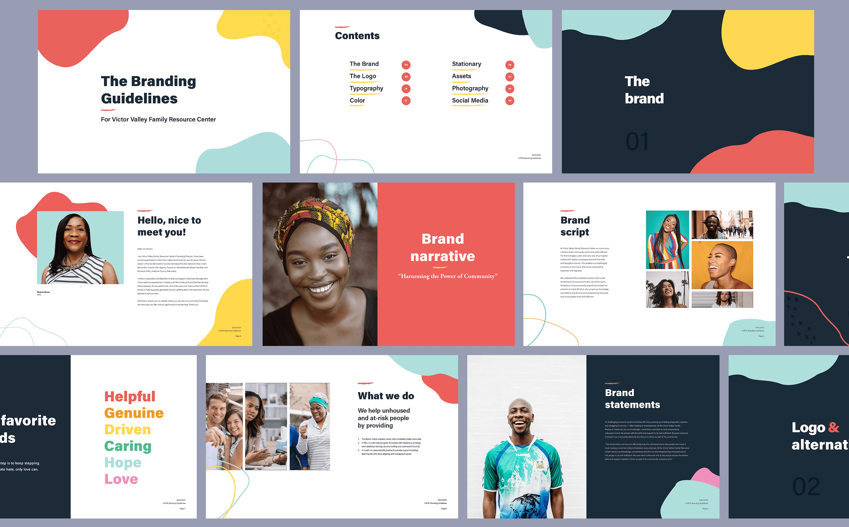
Alongside the website, I created a full brand guidelines document covering the refreshed color system, typography, logo usage, photography direction, and tone of voice. This gave the VVFRC team a self-sufficient reference for maintaining consistency across printed materials, social media, grant applications, and future web updates without needing a designer for every decision. I was not approved to change the original logomark, but I changed all other elements that revolved around the logo.


The redesign gave VVFRC a visual identity that finally matched the scale and heart of their work. A brand that was grey and institutional became colorful and full of hope, reflecting the real experience of the people the organization serves and the community it is trying to build. The website now serves three distinct audiences without confusion, and the brand guidelines give the internal team the tools to maintain that consistency long after the project ended. For a non-profit operating in one of California's most economically challenged regions, a website that communicates trust, urgency, and warmth is not just a design outcome. It directly affects their ability to raise funds, recruit volunteers, and reach the people who need them most.