Understanding the challenge
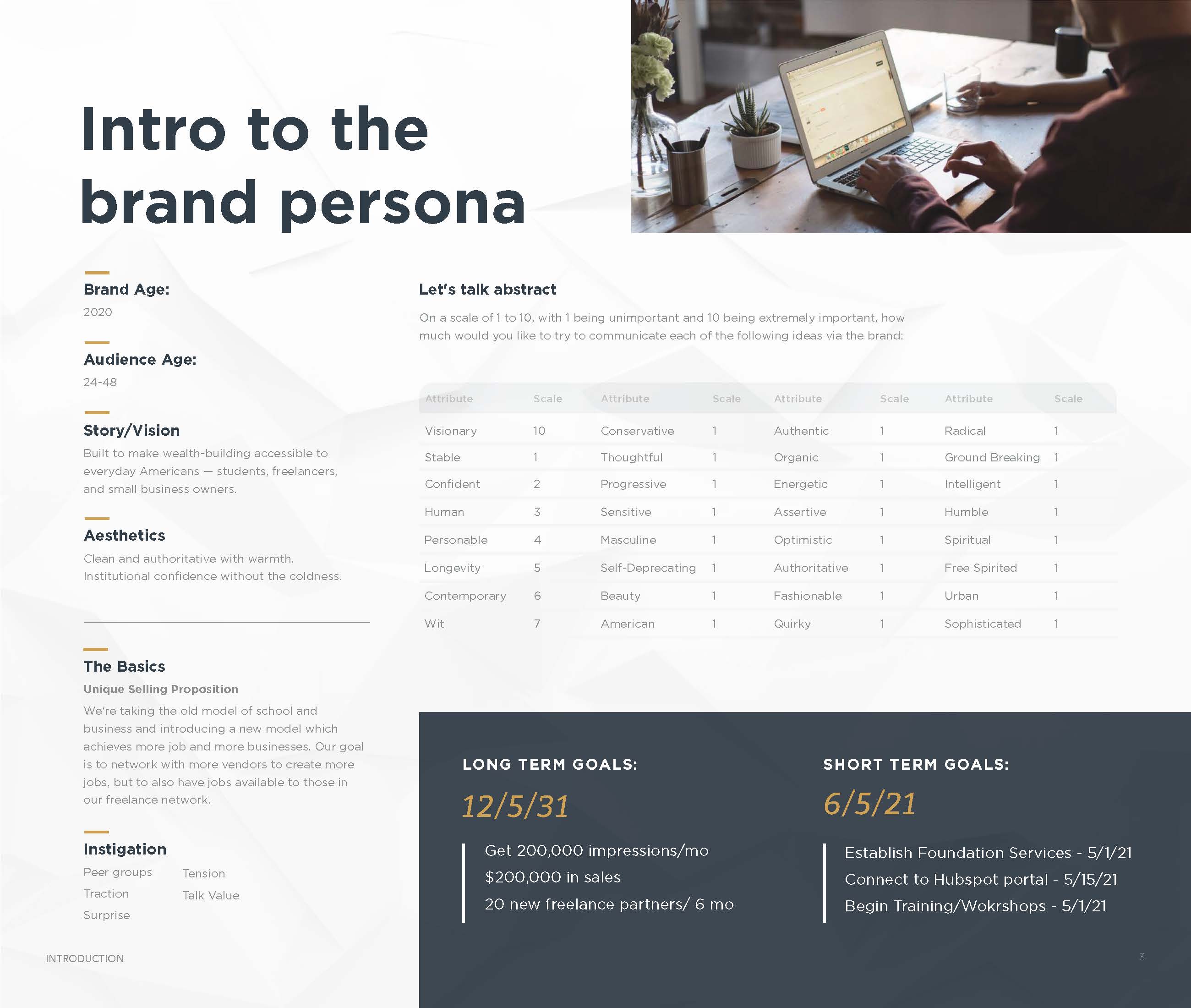
The Builder Group is a fintech and investment company with a clear founding premise: make wealth-building accessible to everyday Americans, including students, freelancers, and small business owners who have been historically excluded from meaningful investment opportunities. CEO David Brown came to this project with a defined mission but no visual identity to support it. The brand needed to signal trustworthiness and authority while staying accessible and human.
Brand strategy and the logomark
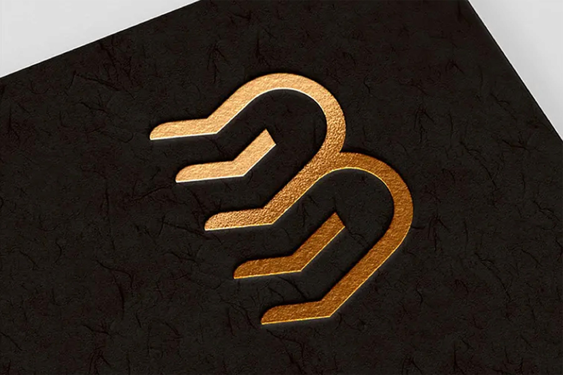
Before any visual work began, I worked with the client to define the brand's philosophical core: its mission, audience, tone, and unique selling proposition. The logomark exploration started with the idea of stacked layers of growth. The final icon uses three stacked horizontal strokes to form a stylized B, communicating both the company name and its core idea. Layer by layer, wealth is built. The icon was rendered in the brand's signature gold and paired with a wordmark set in Gotham Bold.

Color system and typography
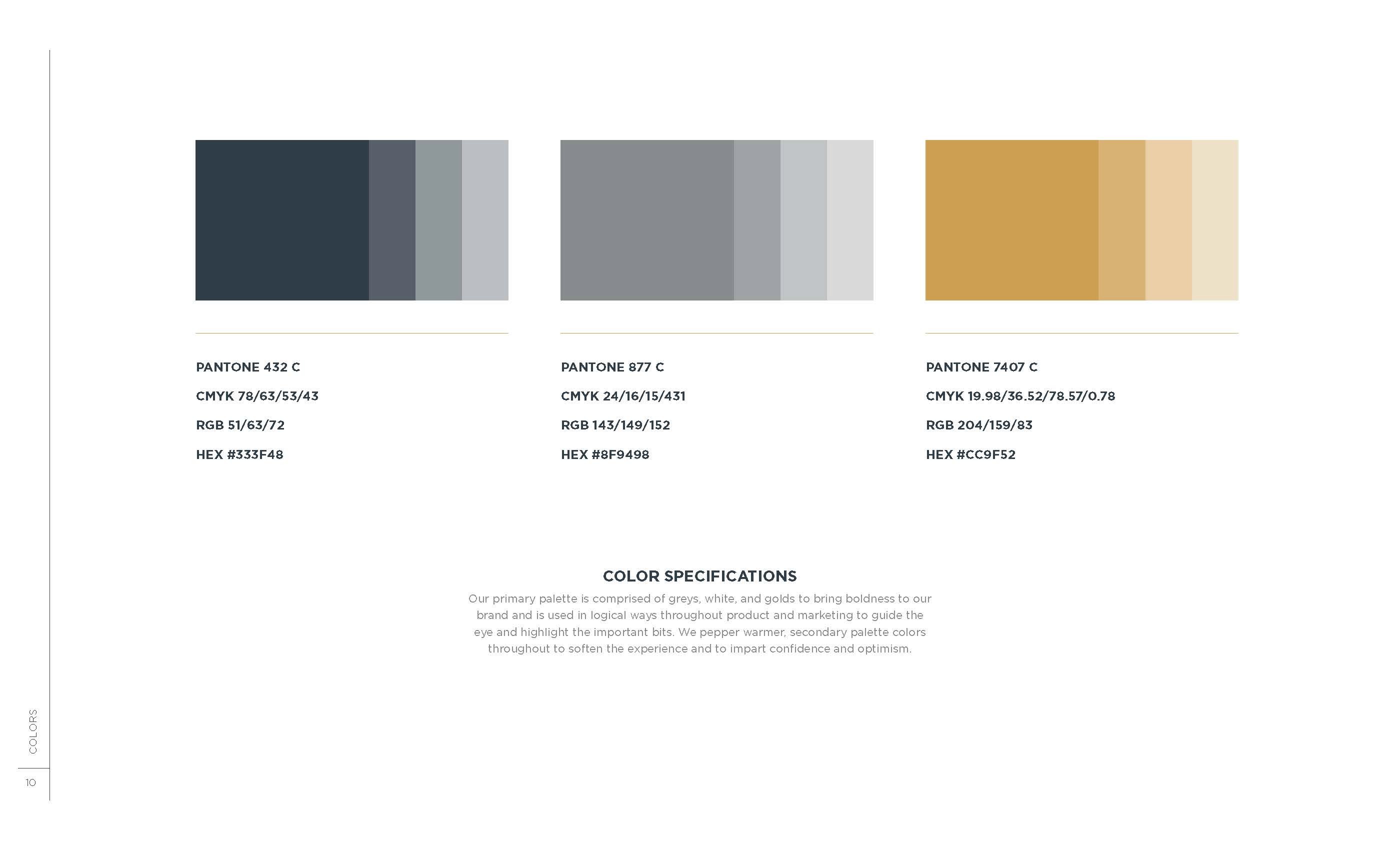
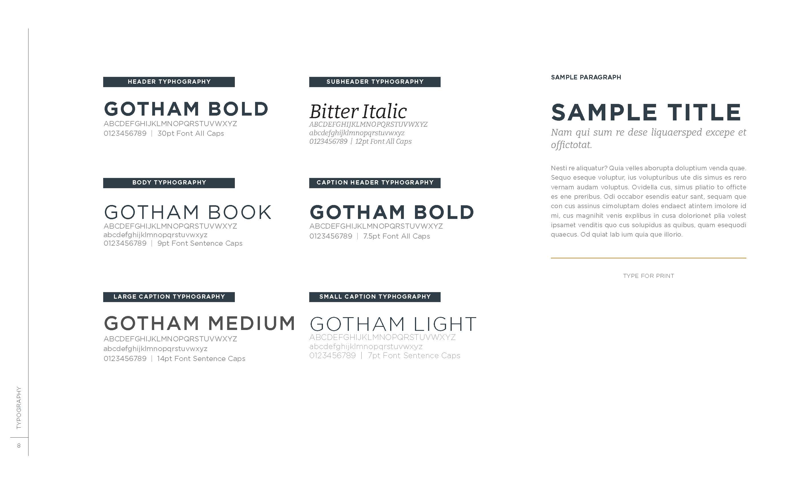
The palette was built around three Pantone-specified values: deep slate (#333F48) for authority, warm grey (#8F9498) for supporting structure, and gold (#CC9F52) as a deliberate accent. A strict ratio was defined in the brand manual: 70% slate, 20% grey, 10% gold. This keeps the gold from being overused, so it retains its impact every time it appears. The typographic system pairs Gotham across weights with Bitter Italic for editorial moments.
Marketing deck and corporate expressions
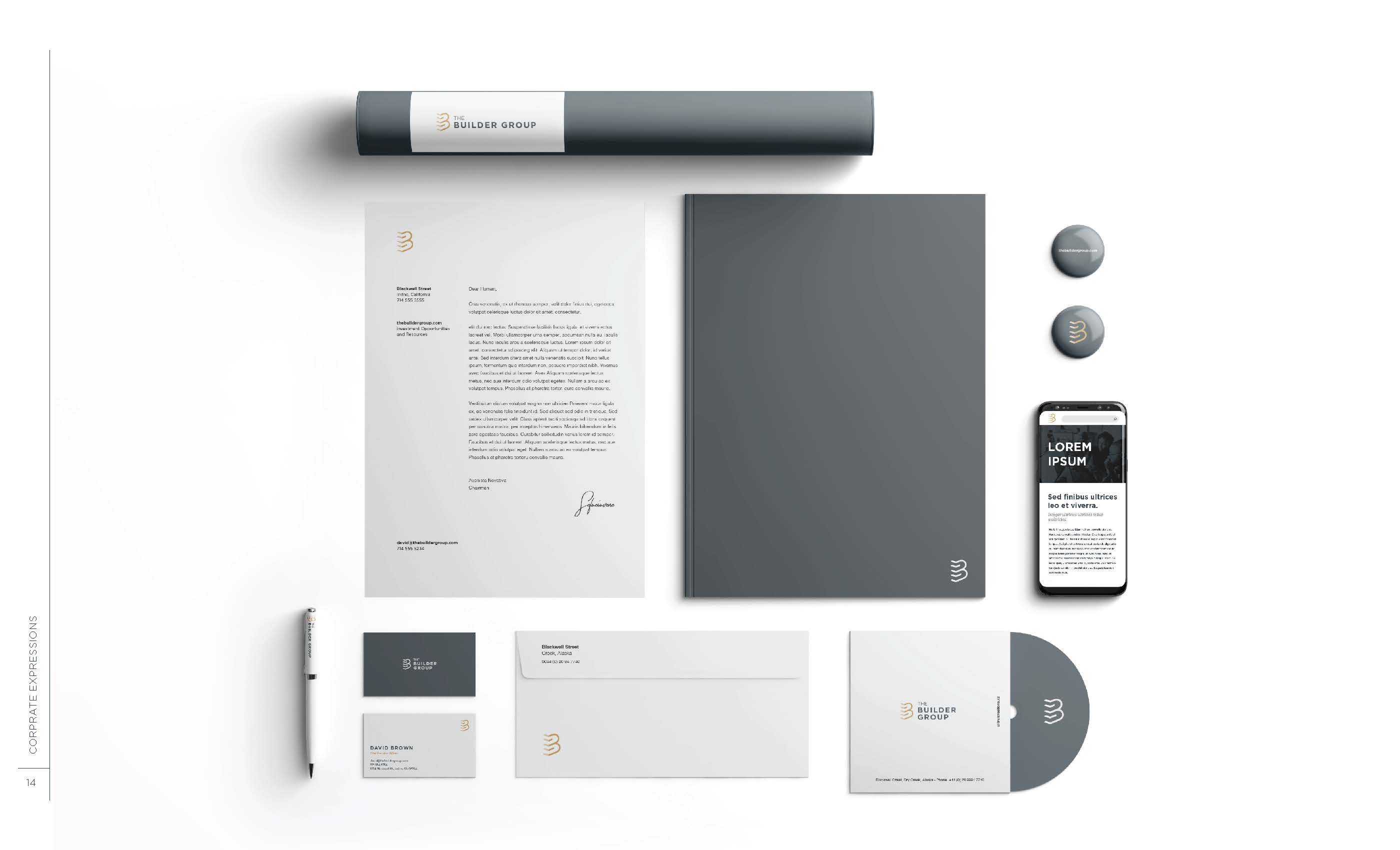
Beyond the visual identity, the engagement included a fully designed 17-slide marketing strategy deck and a sales one-pager. The deck required both design execution and content thinking: structuring the narrative arc, designing slide layouts, and developing infographic frameworks, including a narrative void diagram and sales funnel model. The brand was also extended into a full suite of corporate expressions, including letterhead, business cards, envelopes, and a mobile UI mockup.
The finished brand system gave The Builder Group a complete, self-sufficient identity it could operate independently. Gold was capped at 10% of usage so it would always feel intentional rather than decorative. Gotham was chosen for its institutional confidence without coldness. The marketing deck was designed to function as a brand artifact in its own right: handing it over in a meeting was itself a brand impression. Every deliverable, from the logomark to the one-pager, was produced independently with no art director, copywriter, or junior designer. Strategic thinking, copy, and design were handled in one voice throughout.