
Understanding the challenge
Ocusim is a virtual reality ophthalmology training simulator used in medical schools to teach eye anatomy, physiology, and clinical examination to residents and medical students. Developed at Loyola University Chicago and now used at institutions including TCU's Burnett School of Medicine, the platform puts learners inside an immersive 3D model of the human eye rather than learning from flat textbook diagrams. The brand needed a logo that could communicate two things at once: the clinical precision of ophthalmology and the forward-looking technology of VR simulation.
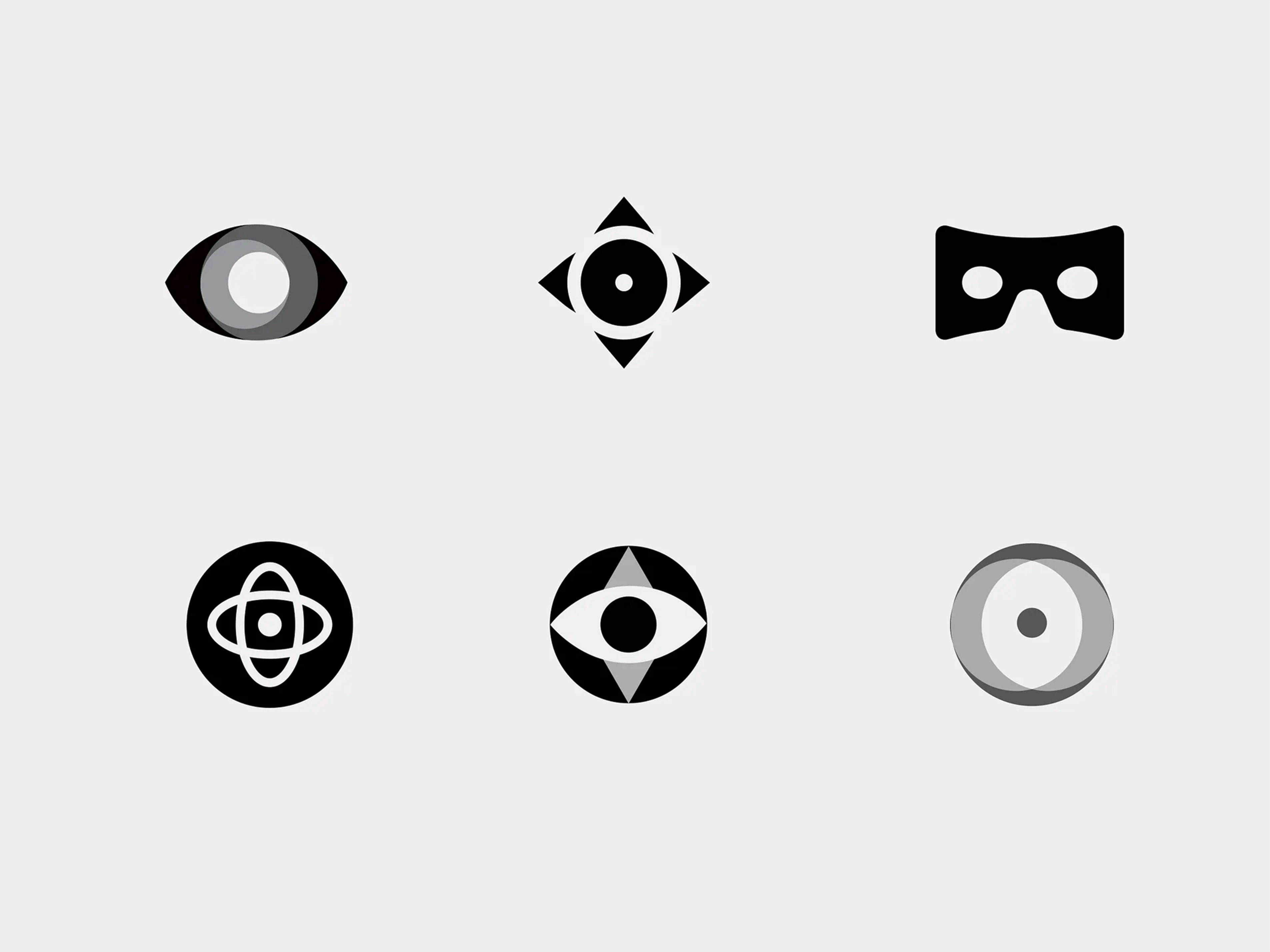
Logomark concept and exploration
The logomark exploration began with a clear conceptual brief: the mark needed to feel medical without feeling cold, and technological without feeling generic. I explored multiple directions before landing on the core concept, a logomark that merges the shape of the human eye with the slit lamp and optical instruments used in ophthalmology exams. The result reads simultaneously as an eye and as a piece of precision equipment, communicating both the subject matter and the simulation technology in a single, cohesive form.
Final logo
The final logomark pairs the custom eye/instrument mark with a clean, confident wordmark. The color palette balances medical authority with the blue and green tones associated with technology and vision, avoiding the sterile whites and greys that most medical brands default to. The mark works across contexts from app icons and VR headset packaging to academic presentations and medical conference materials.

A logo for a product like OcuSim has to do specific conceptual work. It cannot just look medical, because the product is not just a medical tool. It cannot just look technical, because the product is designed to feel human and immersive. The final mark earns its place by genuinely resolving that tension: the eye and the instrument become one form, which is exactly what the product itself does. It puts the clinical instrument inside the human experience. The logomark exploration process, from abstract eye forms to instrument-integrated marks, shows how that concept was tested, refined, and ultimately made precise enough to work at every scale a medical technology brand requires.


