
Bottom of funnel means one thing: close the sale
The Typhoon landing page was not trying to build awareness or generate interest. By the time a visitor arrived, they already knew what a drone was and had likely been researching for weeks. This is a bottom-of-funnel page targeting a high-intent buyer who is comparing the Typhoon against the DJI Phantom 4 and deciding whether the $1,800 is justified. The design job was not to excite. It was to validate, reassure, and remove the last obstacles standing between the visitor and the purchase. Hotjar scroll maps confirmed these visitors were reading deeply, which shaped the decision to lead with drama and follow with technical depth rather than the other way around.
Research and data gathering
Hotjar heatmaps, scroll maps, and user polls were used to understand how visitors were engaging with the existing page. The data revealed that buyers were scrolling deep looking for specific technical validation, safety information, and competitive differentiation before committing at that price point. Scroll maps showed significant engagement in the feature breakdown section, confirming that this audience wanted the spec detail, not a simplified pitch. That insight shaped the page hierarchy directly.
Visual and UX design
The visual design was bold and editorial, leaning into the drama of aerial photography rather than defaulting to a clean tech aesthetic. Designed in Sketch and prototyped in InVision, the layout guided visitors through a deliberate scroll journey: hero, key differentiators, feature breakdown, social proof, and a clear purchase CTA. Large product imagery, dark backgrounds, and strong typographic hierarchy created a sense of scale and ambition that matched the product, built in Adobe Creative Suite. The landing page was built with Sketch and then published and A/B tested in Unbounce.
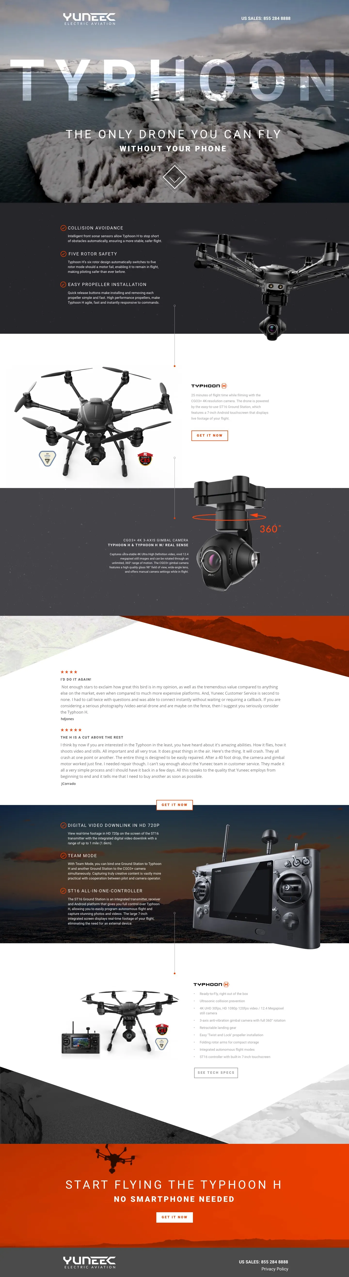
Selling a technically sophisticated product at a high price point online requires the page to do two jobs simultaneously: excite and reassure. The Typhoon landing page earns both by leading with the emotional payoff of what the drone lets you create, then systematically removing every objection a buyer might have about safety, ease of use, and value for money. The result is a page that feels like an extension of the product itself: ambitious, capable, and built for someone who takes their craft seriously.
Results: 27% increase in conversions
The redesigned landing page drove a 27% increase in conversions. For a product at this price point, every percentage point of conversion lift represents significant revenue, making the outcome a strong validation of leading with outcomes over specs and building trust before asking for the sale.